Case Study: Creating a Branded Logo for VA’S Heart Walk
📍 Project Overview
Client: VA Hospital Cardiology Team
Role: Graphic Designer
Timeline: June 2025
Deliverables: Team Logo for print and digital use
The Cardiology team at the VA Hospital approached me to design a professional and visually symbolic logo that represents their specialized work in cardiovascular health for their annual Heart Walk. Cardiologist team wants to incorporate Neurology into the logo this year because neurology team will be joining cardiology for the heart walk. The logo needed to be clean, simple, respectful, and appropriate for both clinical and public-facing materials.
🔍 Goal & Objectives
Create a logo that reflects the heart/cardiovascular and brain/neurology field in a visually impactful but minimal way.
Ensure the design aligns with healthcare professionalism and VA branding guidelines.
Design for versatility: usable in lab coats, presentations, t-shirts, email signatures, and internal documentation.
💡 Research & Inspiration
To understand the team's identity and values, I:
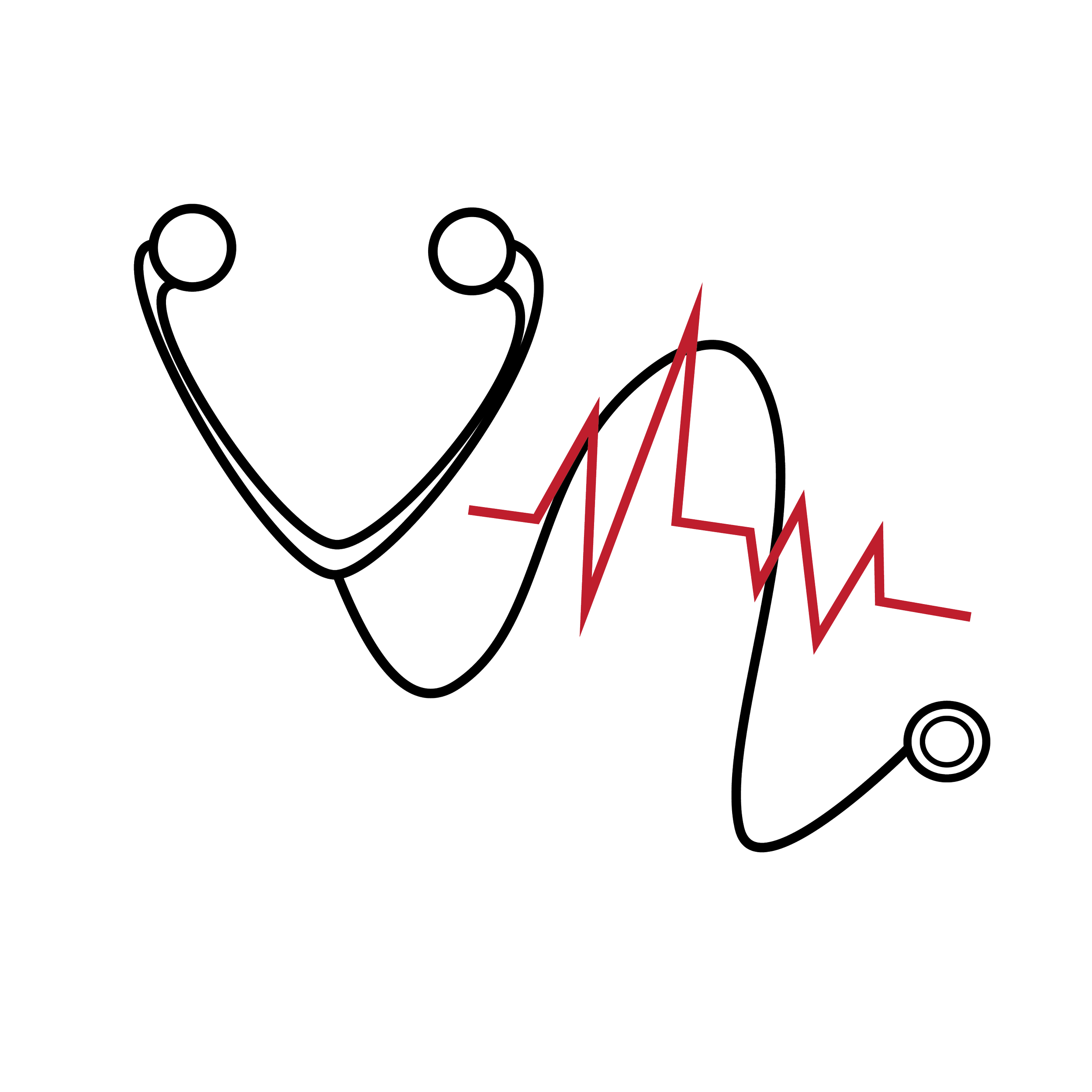
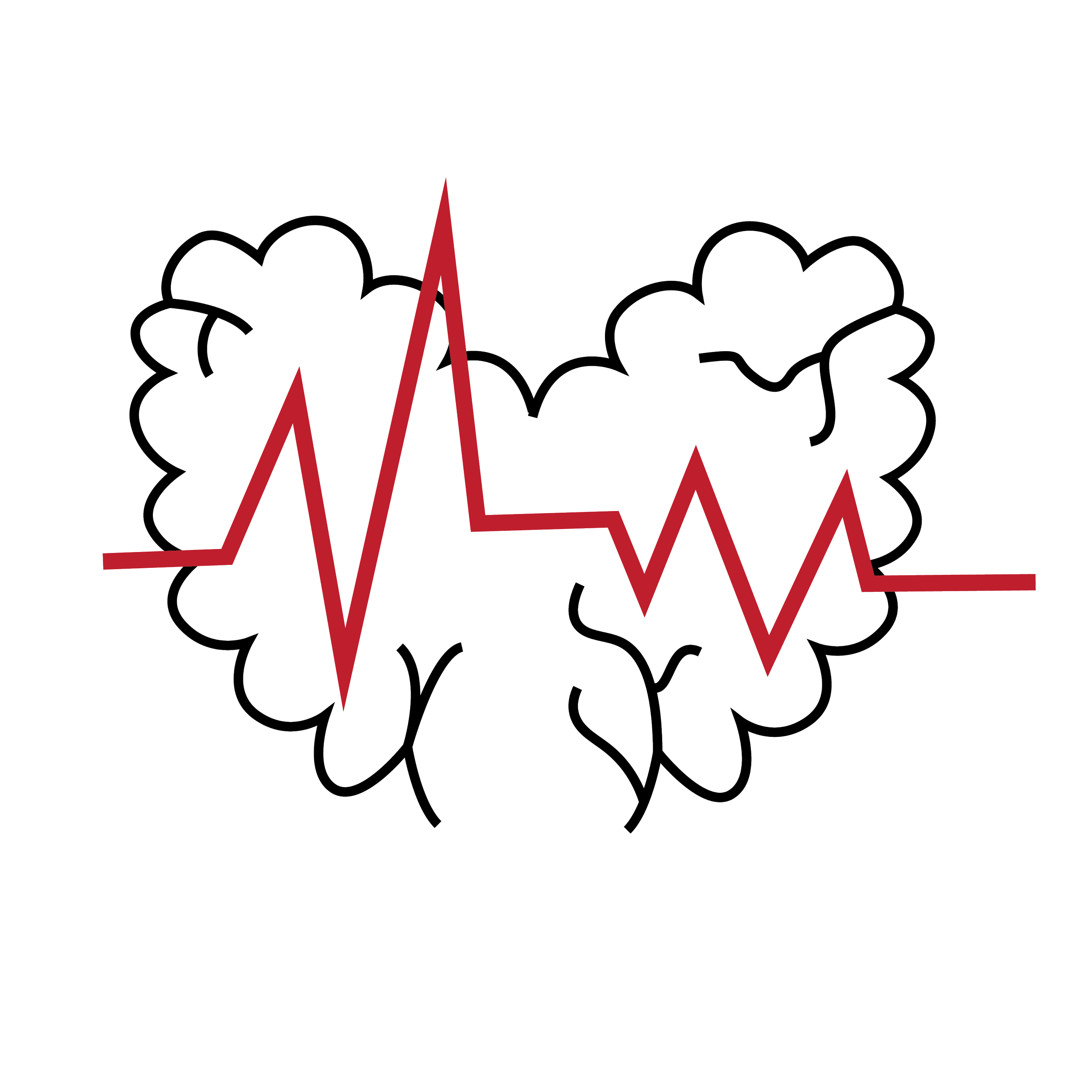
Reviewed cardiology symbols, including EKG lines, heart anatomy, and artery imagery.
Reviewed neurology symbols, including brain, nerve cells, and types of neuron.
Analyzed VA branding standards and color palette.
Took inspiration from medical badges and emblems to give it a sense of unity and credibility.
👥 TARGET AUDIENCE
Hospital staff, patients, event participants
✏️ Design Process
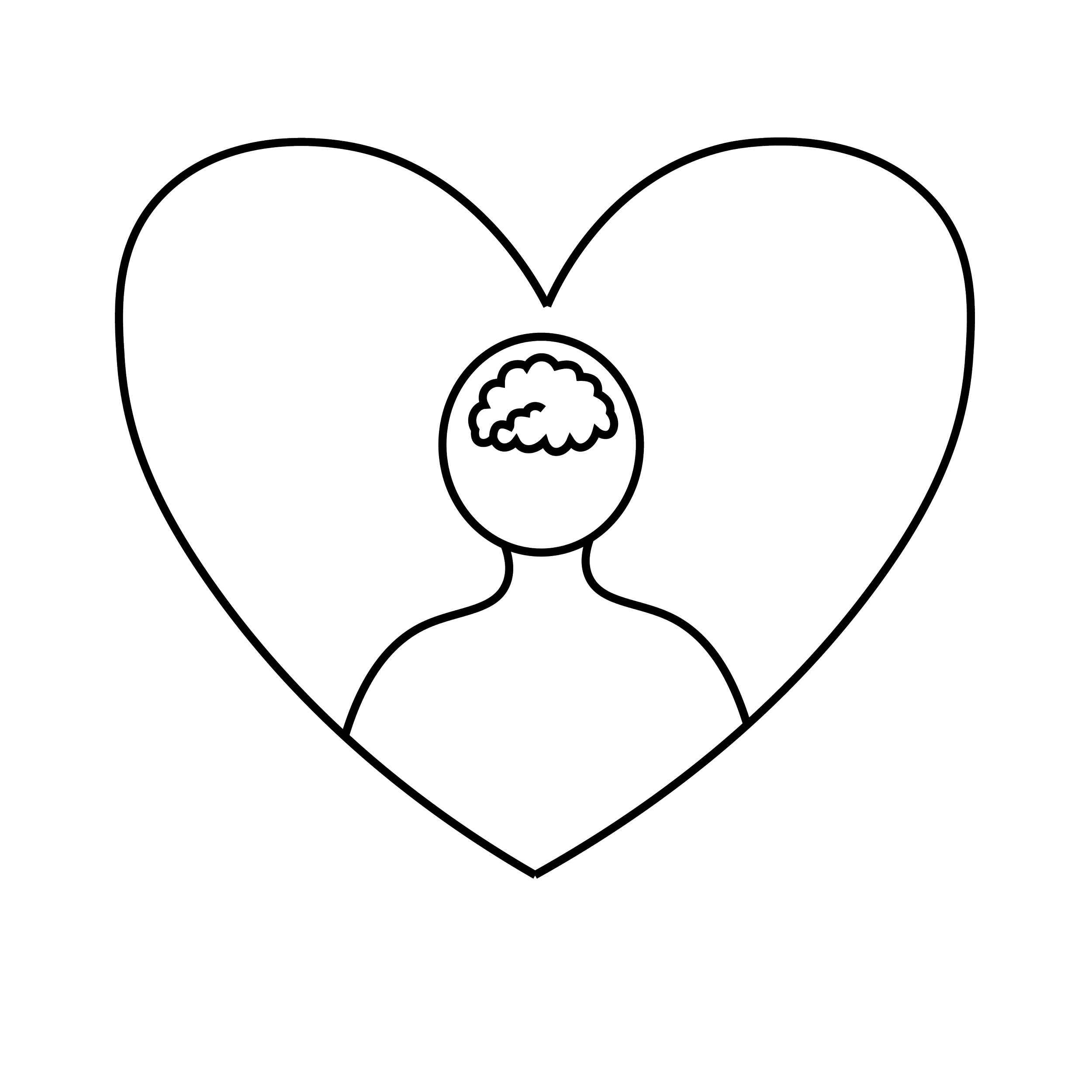
1. Sketching & Concepts
I began with hand-drawn sketches exploring combinations of:
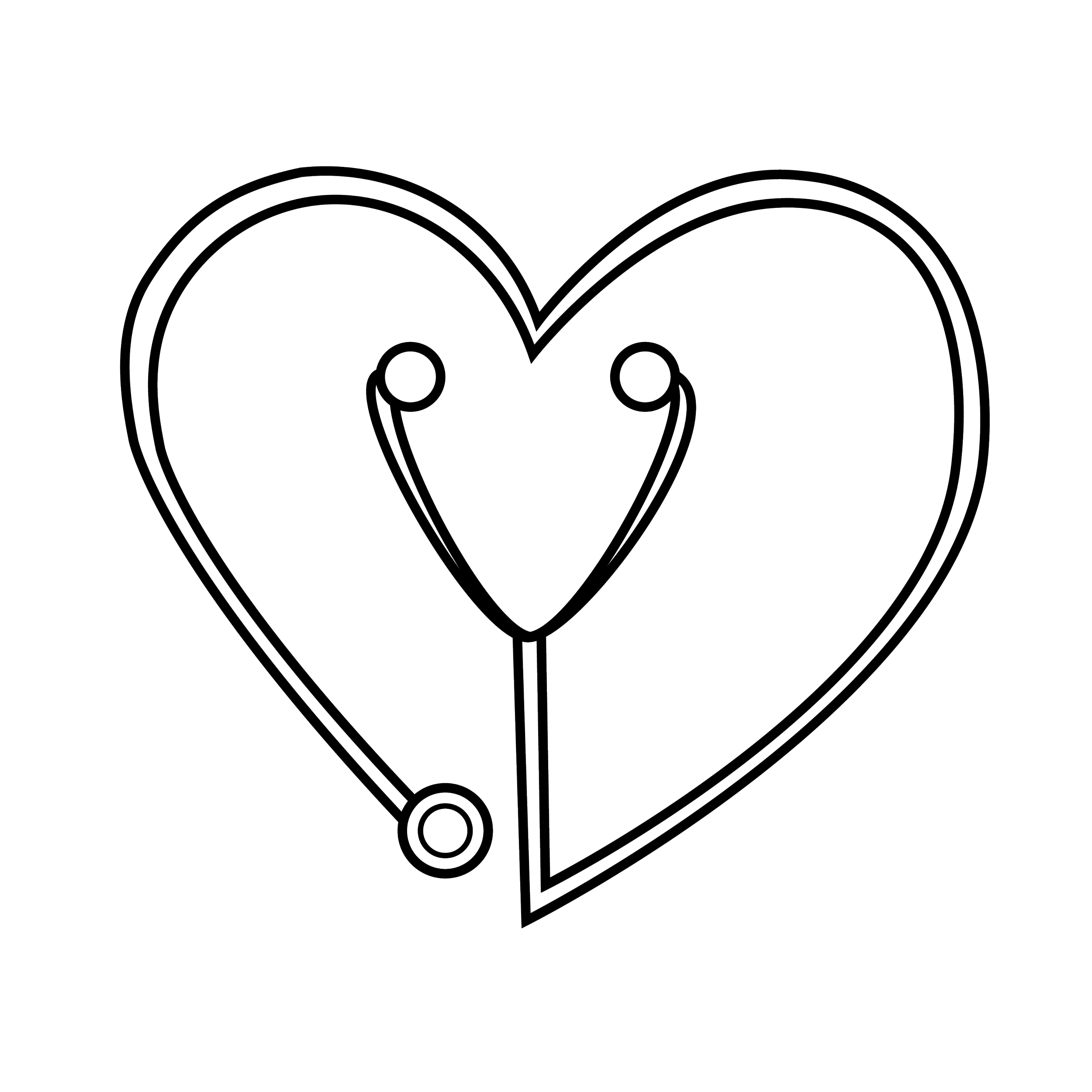
Anatomical heart outlines
EKG waveforms
Circles and shields (for unity/protection themes)
2. Digital Drafts
Using Adobe Illustrator, I created several vector drafts, experimenting with:
Line thickness to balance clarity and subtlety
Monoline vs. filled shapes
Serif vs. sans-serif fonts for professionalism
3. Feedback & Iteration
I shared 2–3 initial concepts with the team and gathered feedback, particularly on:
Readability
Symbolism
Emotional tone (too clinical vs. too abstract)
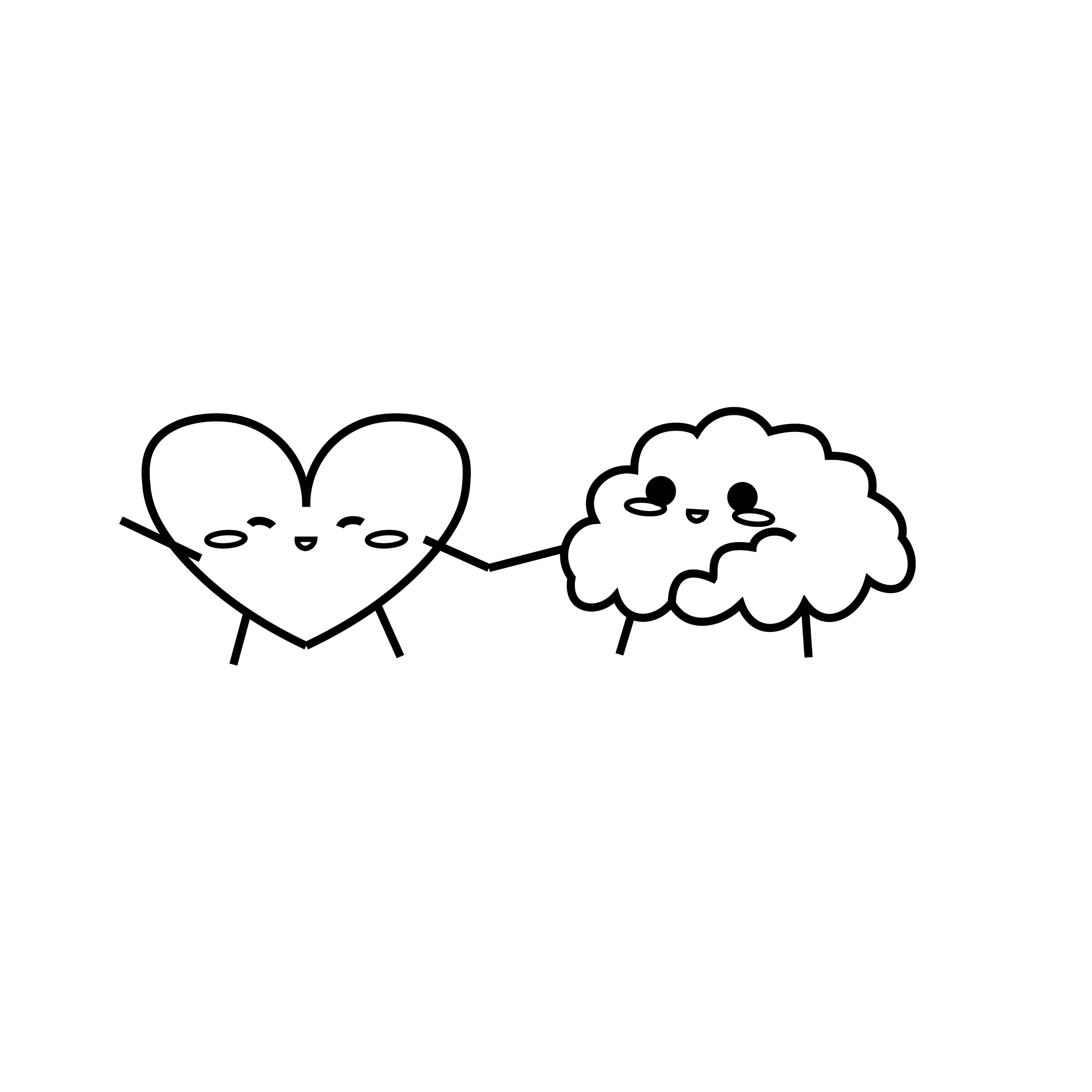
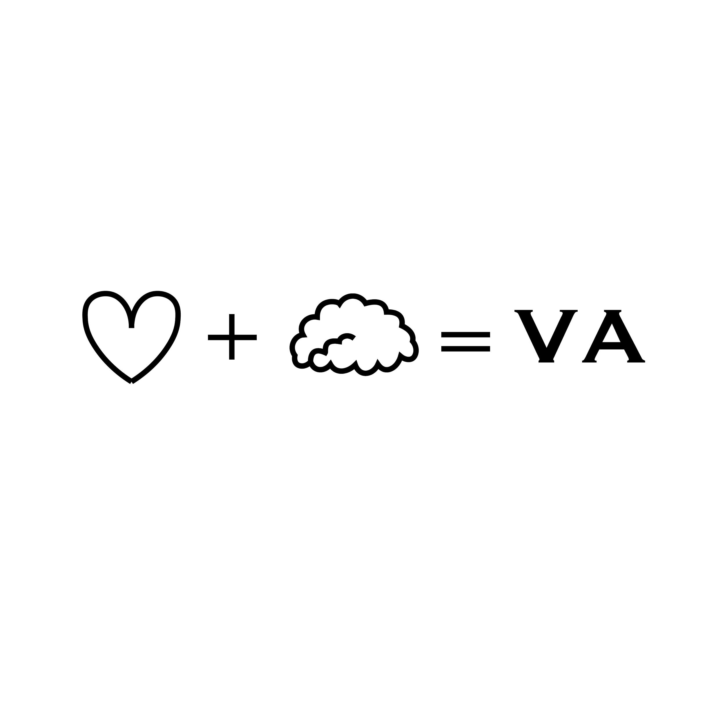
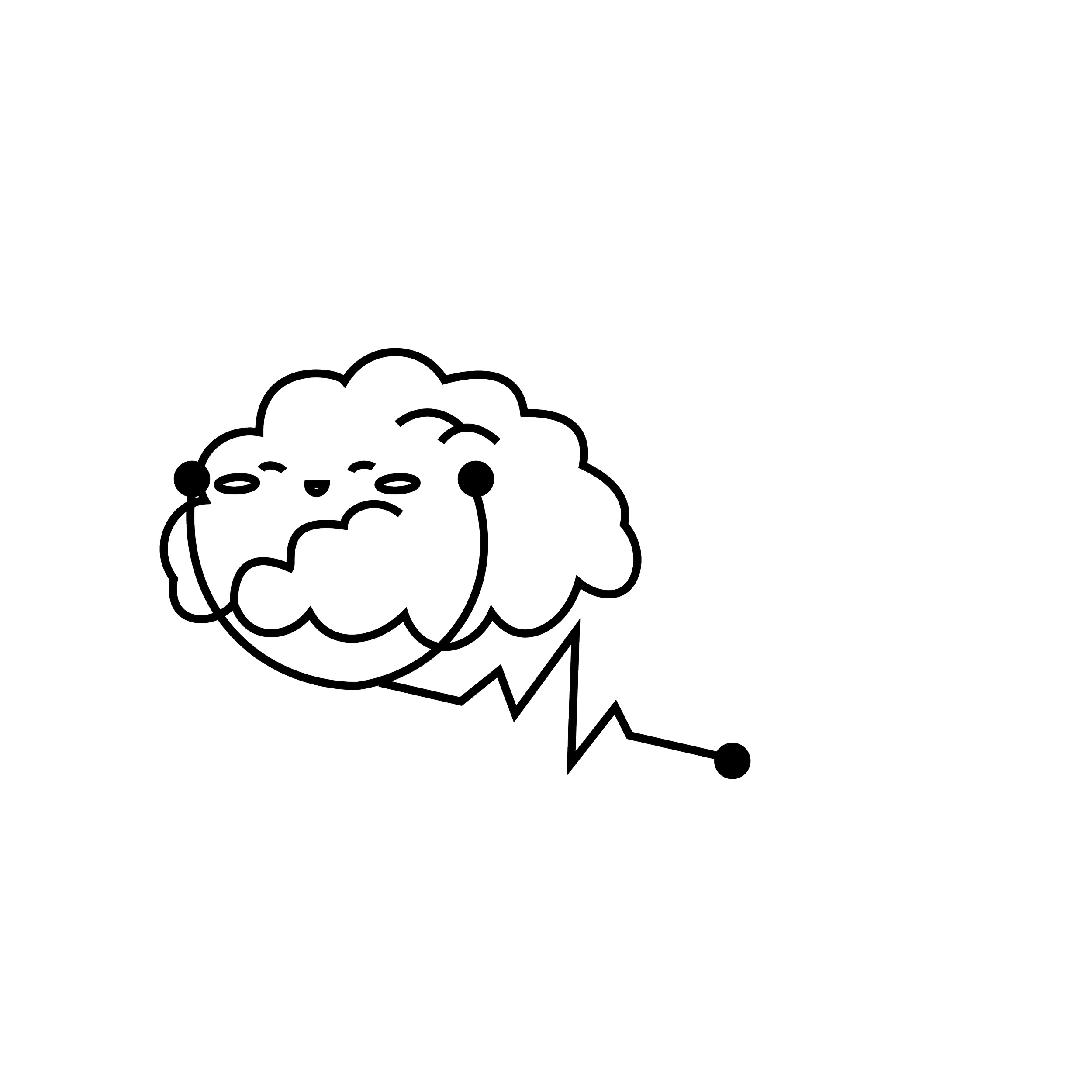
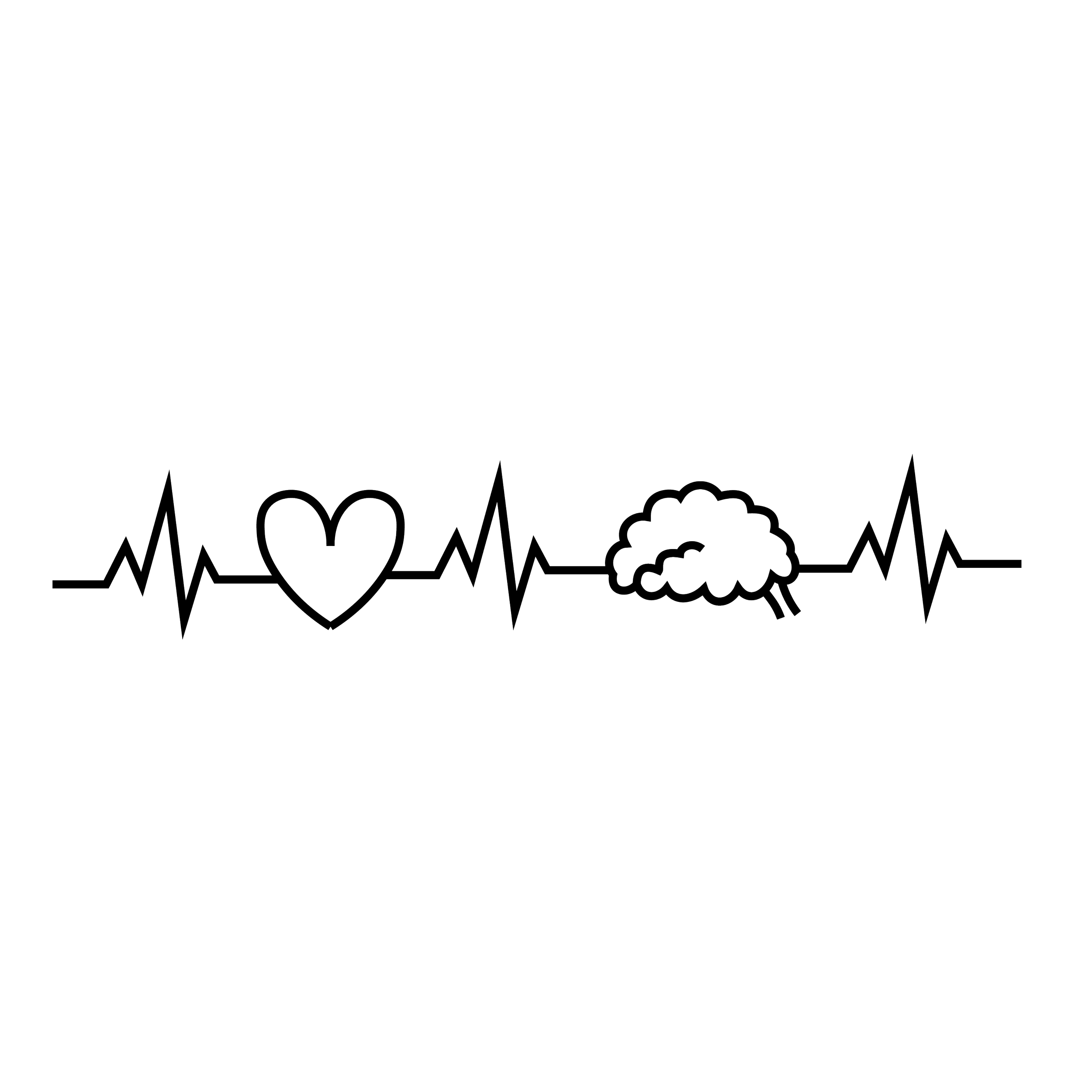
The final direction leaned into a simplified heart + brain in a singular EKG line to symbolize unity.
🎨 Final Logo Design
Icon: A stylized heart and brain combined with an EKG waveform, symbolizing both the organ and its electrical activity.
Color Palette:
Talked to providers and ended up sticking with just black and white due to budget purposes.
Typography: Clean, bold sans-serif font for legibility in both large and small sizes.
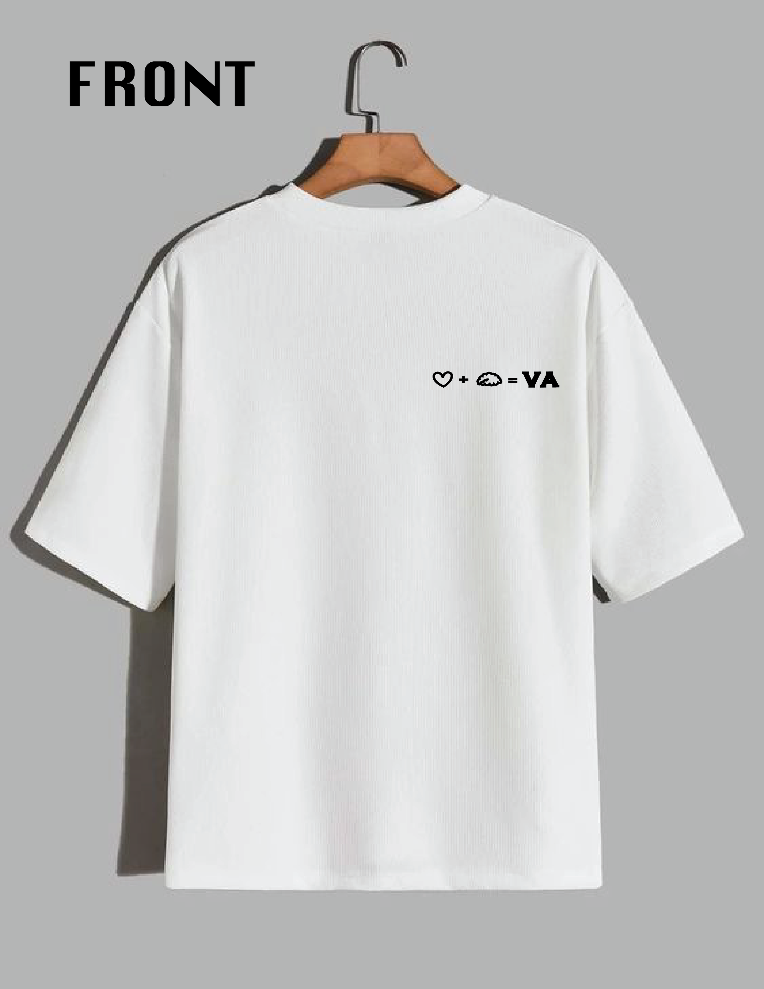
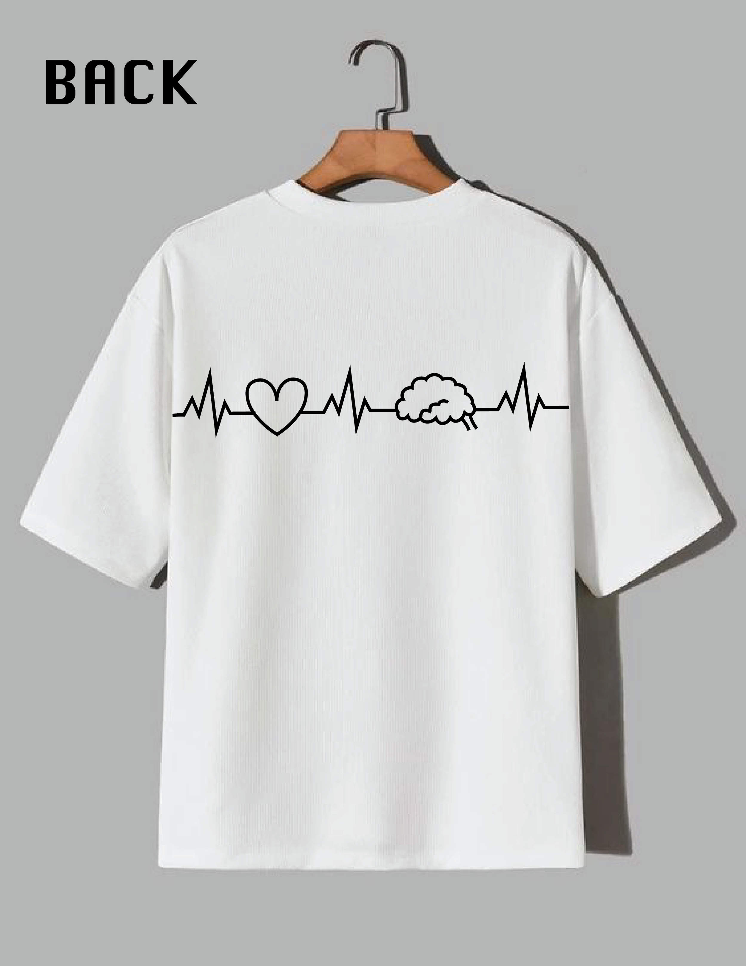
📦 Deliverables Provided
single-color versions + mockup photo
Horizontal and stacked layouts
Vector files (.AI, .SVG), PNGs, and usage guide
🩺 Impact
The team now uses the logo in all internal communications, team apparel, and slide decks.
Received positive feedback from both the cardiology department and hospital leadership, especially the chief of cardiology team.
Helped unify the team’s identity and added a visual professionalism to their presence.
🧠 Reflection
This project strengthened my understanding of branding for healthcare and the balance of symbolism vs. clarity. Designing with medical professionals in mind required a thoughtful, respectful approach—while still offering creativity within limitations.